Alle OpenHAB Tutorials
- OpenHAB 3 Camera Binding
- OpenHAB 3 Camera Widget
- OpenHAB 3 in Docker
- OpenHAB 3 MQTT Binding
- OpenHAB Smarthome
- OpenHAB IP Camera Binding
- openHABian on a Raspberry Pi
- INSTAR MQTT - OpenHAB2
All OpenHAB FAQs
- OpenHab MQTT Auto-Discovery
- OpenHab3 IpCamera Binding Alarmserver
- OpenHab3 IpCamera Binding with an WQHD Camera
- Using OpenHab3 in Docker with an WQHD Camera
- OpenHAB v3 Configuration for your WQHD INSTAR MQTTv5 Broker
- OpenHAB v3 filebased Configuration for your WQHD INSTAR MQTTv5 Broker
- OpenHAB v3 Rules for your WQHD INSTAR MQTTv5 Broker
- OpenHAB v3 Blockly Scripts for your WQHD INSTAR MQTTv5 Broker
- OpenHAB v3 Sitemaps for your WQHD INSTAR MQTTv5 Broker
- Debugging the OpenHAB IP Camera Binding
OpenHAB 3 Camera Widget
Make your camera the heart of your smart home
Using the MQTT interface of your INSTAR Full HD cameras you can connect them to an existing smarthome system (Home Assistant, OpenHAB, Node-RED, Athom Homey, Homematic, ioBroker, Loxone, homee) can be added. Or even make it the main broker for your MQTT sensors. MQTT allows you to automate ALL functions of your camera and link them to other services in your smarthome.
Control your camera via the IFTTT online service

On the IFTTT platform, we provided a service called INSTAR. The INSTAR applets provide you with the ability to control some settings of your INSTAR camera or INSTAR Cloud with IFTTT. You can connect INSTAR with triggers for location (Geo Location) and date & time, send notifications and much more. For example, you can connect INSTAR applets to the IFTTT location service and automatically disable the alarm when you arrive home. You can also use the INSTAR applets to create your own automation and connect them to other third-party applets.
Create your Camera
First we need to add our camera as an Equipment. To do this go to Settings and click on Model:

Click on Create Equipment from Thing:

And select your camera that you added using the Camera Binding.

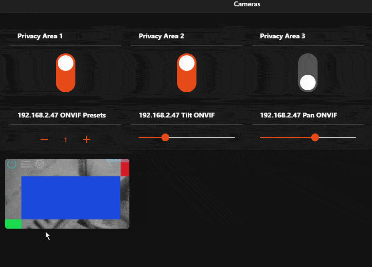
Make sure to click show advanced to see all the channels and tick the Pan, Tilt, Zoom, GoToPreset and MJPEG URL channels as a minimum.
Create the Widget Template
Currently (12.01.2021) the camera widget is not yet part of the standard OpenHAB widgets and has to be created manually. We need to add our widget code via the Developer Tools menu. Click on Create Widget and copy&paste the following code:

uid: ClickablePTZCamera
props:
  parameters:
    - context: item
      label: Select the Camera to Control
      name: camera
      required: true
      type: TEXT
    - context: item
      label: Item for Switch
      name: switchItem
      required: false
      type: TEXT
    - label: Invert Tilt Controls
      name: invertTilt
      required: true
      type: BOOLEAN
    - label: Show Discrete Controls
      name: showControls
      required: true
      type: BOOLEAN
  parameterGroups: []
timestamp: Dec 29, 2020, 11:56:36 AM
component: f7-card
config:
  class: no-margin
  expandable: true
  style:
    border-radius: 6px
    --f7-card-margin-horizontal: 0px
    width: 16rem
    height: 9rem
slots:
  default:
    - component: f7-card-content
      config:
        class: card-opened-fade-out
        style:
          color: white
          background-image: ="url('"+items[props.camera + "_MJPEGURL"].state+"')"
          background-size: 17rem 10rem
          background-repeat: no-repeat
          border-radius: 6px
          z-index: -1
    - component: f7-card-content
      config:
        class: card-opened-fade-in
        style:
          color: white
          background-image: ="url('"+items[props.camera + "_MJPEGURL"].state+"')"
          background-size: 100% auto
          background-position: center
          background-repeat: no-repeat
          z-index: -1
    - component: oh-link
      config:
        class: card-prevent-open
        style:
          margin: 0em 0.2em
          color: "=(items[props.switchItem].state === 'ON') ? 'cyan' : 'white'"
          opacity: "=(items[props.switchItem].state === 'ON') ? '0.4' : '0.3'"
        visible: =props.switchItem !== undefined
        iconF7: power
        iconSize: 22
        action: toggle
        actionItem: =props.switchItem
        actionCommand: ON
        actionCommandAlt: OFF
    - component: oh-link
      config:
        class: card-prevent-open
        style:
          margin: 0 0.2em
          color: white
          opacity: 0.3
        visible: =props.showControls === true
        iconF7: arrow_left
        iconSize: 22
        action: command
        actionItem: =props.camera + "_Pan"
        actionCommand: INCREASE
    - component: oh-link
      config:
        class:
          - card-prevent-open
        style:
          margin: 0 0.2em
          color: white
          opacity: 0.3
        visible: =props.showControls === true
        iconF7: arrow_up
        iconSize: 22
        action: command
        actionItem: =props.camera + "_Tilt"
        actionCommand: "=(props.invertTilt) ? 'INCREASE' : 'DECREASE'"
    - component: oh-link
      config:
        class: card-prevent-open
        style:
          margin: 0 0.2em
          color: white
          opacity: 0.3
        visible: =props.showControls === true
        iconF7: arrow_down
        iconSize: 22
        action: command
        actionItem: =props.camera + "_Tilt"
        actionCommand: "=(props.invertTilt) ? 'DECREASE' : 'INCREASE'"
    - component: oh-link
      config:
        class: card-prevent-open
        style:
          margin: 0 0.2em
          color: white
          opacity: 0.3
        visible: =props.showControls === true
        iconF7: arrow_right
        iconSize: 22
        action: command
        actionItem: =props.camera + "_Pan"
        actionCommand: DECREASE
    - component: oh-link
      config:
        class: card-prevent-open
        style:
          margin: 0 0.2em
          color: white
          opacity: 0.3
        visible: =props.showControls === true
        iconF7: plus
        iconSize: 22
        action: command
        actionItem: =props.camera + "_Zoom"
        actionCommand: INCREASE
    - component: oh-link
      config:
        class:
          - card-prevent-open
        style:
          margin: 0 0.2em
          color: white
          opacity: 0.3
        visible: =props.showControls === true
        iconF7: minus
        iconSize: 22
        action: command
        actionItem: =props.camera + "_Zoom"
        actionCommand: DECREASE
    - component: oh-link
      config:
        class: card-prevent-open
        style:
          margin: 0 0.2em
          color: white
          opacity: 0.3
        iconF7: list_number
        iconSize: 22
        action: options
        actionItem: =props.camera + "_GoToPreset"
    - component: oh-link
      config:
        class: card-prevent-open
        style:
          margin: 0 0.2em
          color: white
          opacity: 0.3
        iconF7: gear_alt
        iconSize: 22
        action: group
        actionGroupPopupItem: =props.camera
    - component: oh-link
      config:
        style:
          position: absolute
          top: 7.8rem
          right: 0.2rem
          color: white
          opacity: "=(items[props.camera + '_MotionAlarm'].state === 'ON') ? '0.5' : '0'"
        iconF7: eye
        iconSize: 18
    - component: oh-link
      config:
        style:
          position: absolute
          top: 7.7rem
          left: 0rem
          color: white
          opacity: "=(items[props.camera + '_AudioAlarm'].state === 'ON') ? '0.5' : '0'"
        iconF7: ear
        iconSize: 18
Now, when you edit your page, you will have the option to add a Personal Widget with name ClickablePTZCamera:

In Select the Camera to Control select the camera you created in step 1:

The widget allows you to pan&tilt your camera as well as giving you access to your camera's live video and all function that you selected when creating your camera in step 1: